
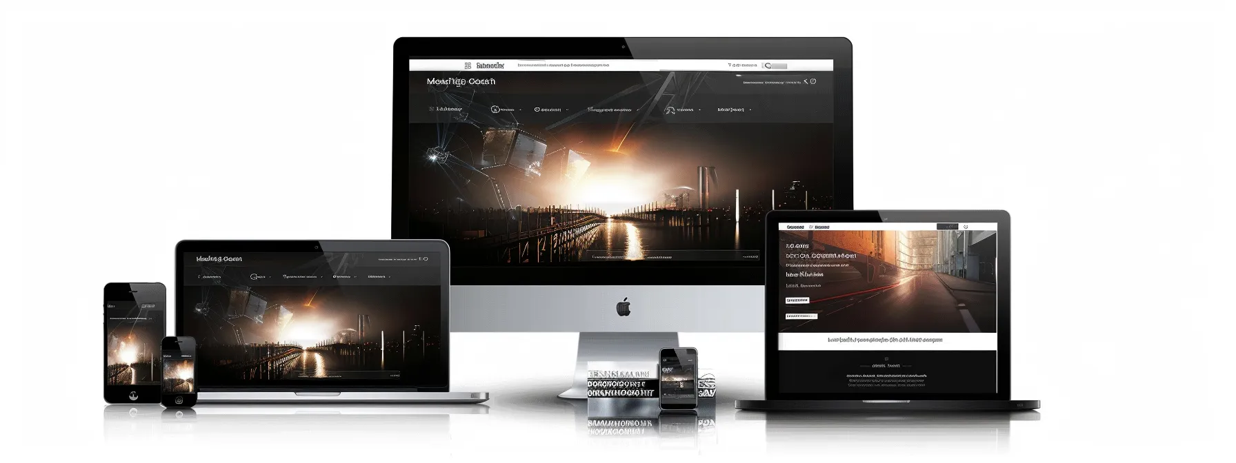
Is your small website struggling to adapt to different screen sizes? Responsive design is crucial for providing a seamless user experience across devices. This guide will explore key strategies for implementing responsive design on small websites, focusing on mobile-first approaches, flexible layouts, and optimized media. By following these techniques, you’ll learn how to create a website that looks great and functions well on any device, improving user engagement and satisfaction.
Key Takeaways
- Responsive design enhances user experience across devices and improves search engine rankings
- Mobile-first approach prioritizes essential content for smaller screens, optimizing for mobile users
- Flexible grids and layouts using CSS Grid or Flexbox create adaptable designs across devices
- Optimize images with SVGs and responsive techniques for seamless display on all screen sizes
- Cross-device testing and user feedback are crucial for refining responsive design effectiveness
Understand the Importance of Responsive Design for Small Websites
Responsive design is crucial for your small website’s success. It enhances user experience across devices, from desktop computers to mobile phones, ensuring accessibility for all visitors. Additionally, implementing a mobile-friendly design boosts your search engine rankings, improving your web visibility and attracting more potential customers through effective search engine optimization.
Enhance User Experience Across Devices
Responsive web design ensures your website’s page layout adapts seamlessly to various screen sizes, from desktop computers to smartphones. By implementing CSS techniques that adjust content dynamically, you create a consistent and enjoyable mobile web experience for all users, regardless of their device.
Your website’s responsiveness directly impacts user engagement and conversion rates. A well-executed responsive design reduces bounce rates by eliminating the need for excessive zooming or horizontal scrolling on smaller screens. This improved usability encourages visitors to spend more time exploring your content and interacting with your site, ultimately leading to better business outcomes.
Boost Search Engine Rankings With Mobile-Friendly Design
By implementing a mobile-friendly design, you can significantly boost your website’s search engine rankings. Search engines like Google prioritize responsive websites in their algorithms, recognizing the importance of providing a seamless experience across all devices. Your fluid layout ensures that web browsers can easily render your content on various screen sizes, improving your site’s visibility in search results.
A responsive design also enhances your web application’s performance, which is crucial for search engine optimization. Fast-loading pages and smooth navigation contribute to better user engagement metrics, signaling to search engines that your site offers value to visitors. By optimizing your site for mobile devices, you’re not only improving the user experience but also increasing your chances of ranking higher on the internet’s most popular search engines.
Assess Your Current Website’s Responsiveness

To implement responsive design effectively, start by evaluating your current website’s performance. Use online tools to assess how your site adapts across devices and identify areas for improvement. This analysis will guide your web development efforts, enhancing usability and potentially boosting your advertising reach. Leverage analytics and platforms like BrowserStack to gain comprehensive insights into your site’s responsiveness.
Use Online Tools to Evaluate Performance
Utilize online tools to assess your website’s responsiveness across various devices, from laptops to mobile phones. These tools simulate different screen sizes and breakpoints, allowing you to identify potential layout issues and ensure your content adapts seamlessly to each viewport. Pay attention to how images, text, and interactive elements behave on different devices to optimize the user experience.
Analyze your website’s performance on mobile apps and browsers using tools that provide detailed reports on load times, rendering issues, and pixel-perfect accuracy. These insights help you pinpoint areas for improvement, such as optimizing images or adjusting CSS media queries, ensuring your responsive design functions flawlessly across all platforms.
Identify Areas That Need Improvement
Analyze your web page’s user interface to identify elements that don’t adapt well to different screen sizes. Pay close attention to navigation menus, forms, and images that may become difficult to use or view on smaller devices. Consider your target audience’s preferences and typical devices to prioritize improvements that will have the most impact on their experience.
Evaluate your website’s typeface choices and text readability across various screen sizes. Ensure that font sizes and line heights adjust appropriately for smaller screens, maintaining legibility without requiring users to zoom in. Also, check for any overlapping content or misaligned elements that could hinder the user experience on different devices.
Implement a Mobile-First Design Approach

Adopt a mobile-first approach to ensure your website’s responsive design prioritizes the mobile experience. Focus on simplifying layouts and prioritizing essential content for smaller screens, making information easily accessible without excessive scrolling. This strategy optimizes your HTML and style sheets for mobile phones, creating a solid foundation for expanding to larger devices.
Prioritize Content for Smaller Screens
When prioritizing content for smaller screens, focus on delivering essential information that users can easily access without excessive scrolling. Organize your content using a responsive grid system, allowing elements to reflow seamlessly as the screen size changes. This approach ensures that your most important messages and calls-to-action remain prominently displayed, improving user engagement and search engine visibility.
Optimize your website’s cache and loading speed by compressing images and minimizing unnecessary content on mobile devices. Consider using techniques like lazy loading to defer the loading of off-screen images, reducing initial page load times. This strategy not only improves user experience but also positively impacts your search engine rankings, as page speed is a crucial factor in mobile-first indexing.
Simplify Layouts for Better Mobile Navigation
Simplify your mobile layout by adapting elements to the display size and ratio of smaller screens. Replace text-heavy navigation menus with a hamburger button, using an SVG icon for crisp rendering across devices. This approach conserves valuable screen space and provides a clean, intuitive interface for mobile users.
Optimize your content hierarchy for mobile viewing by prioritizing essential information and calls-to-action. Implement a single-column layout that adjusts smoothly to different screen ratios, ensuring your key messages remain prominent regardless of the device. This streamlined approach enhances user experience and supports better engagement on mobile platforms.
Utilize Flexible Grids and Layouts

Implement flexible grids and layouts to create responsive structures for your small website. Use CSS Grid or Flexbox to build adaptable designs that adjust seamlessly across devices. Customize layouts for different screen sizes, ensuring optimal display of graphics and content. These techniques, combined with proper image scaling and minimal JavaScript, form the foundation of effective mobile app development and responsive web design.
Apply CSS Grid or Flexbox for Responsive Structures
Apply CSS Grid or Flexbox to create responsive structures that adapt seamlessly to various screen dimensions. These powerful layout systems allow you to design flexible grids that automatically adjust content placement, improving readability and user experience across devices. By utilizing these CSS features, you can create fluid layouts that maintain consistency in design while optimizing for different viewport sizes.
Combine CSS Grid or Flexbox with responsive typography techniques to ensure your fonts scale appropriately on different screens. This approach enhances readability and maintains visual hierarchy, crucial for a positive user experience. Consider integrating frameworks like Bootstrap to streamline your responsive design process, providing pre-built components and grid systems that simplify the implementation of flexible layouts.
Customize Layouts for Different Screen Sizes
Customize your website’s layout for different screen sizes to optimize the user experience on various devices. Adjust your navigation menu for touchscreen interfaces, ensuring buttons are large enough for easy tapping. For landscape orientations, consider a horizontal layout that maximizes screen real estate, enhancing the visibility of key marketing elements.
Adapt your image display strategy based on screen dimensions. Use CSS media queries to serve appropriately sized images, reducing load times on mobile devices while maintaining quality on larger screens. Implement a responsive image gallery that adjusts the number of columns based on available space, ensuring your visual content remains impactful across all devices.
Optimize Images and Media for All Devices

Optimize your website’s images and media for seamless display across all devices. Use scalable vector graphics (SVGs) for logos and icons to maintain crisp quality at any size. Implement responsive image techniques to ensure your visuals adapt to different screen heights and widths, enhancing your brand’s presentation on both Android and iOS devices.
Use Scalable Vector Graphics (SVGs) for Better Scaling
Implement Scalable Vector Graphics (SVGs) for your website’s logos, icons, and simple illustrations to ensure crisp image resolution across all devices. SVGs maintain their quality regardless of screen size, making them ideal for responsive design. Use SVGs for elements like the hamburger menu icon, which remains sharp on both mobile and desktop displays, enhancing your user experience design.
Optimize your SVGs for faster loading times by removing unnecessary metadata and simplifying paths. This approach not only improves your website’s performance but also supports your email marketing efforts by ensuring your brand elements look professional on various email clients. Consider using SVGs with different color variations to match your website’s theme and maintain visual consistency across devices.
Implement Responsive Image Techniques
Implement responsive image techniques to ensure your visual hierarchy adapts seamlessly across devices. Use the HTML element “picture” to provide multiple image sources, allowing browsers to select the most appropriate version based on screen size. This approach optimizes your landing page’s performance and maintains visual impact, drawing attention to key elements regardless of the device used.
Leverage CSS media queries to adjust image sizes and layouts dynamically, ensuring your call to action remains prominent on all screens. Apply the “srcset” attribute to specify different image resolutions, enabling browsers to choose the best option for each device’s display capabilities. This technique enhances your website’s loading speed and user experience, contributing to better engagement and conversion rates.
Enhance Site Navigation for Touch Interfaces

Optimize your website’s navigation for touch interfaces to improve user experience on mobile devices. Focus on designing thumb-friendly buttons and streamlining menus for easier use. Adapt your navigation bar to work seamlessly across iOS and Android platforms, ensuring your WordPress site is fully responsive. Implement HTTP-based solutions to enhance touch interactions and simplify mobile navigation.
Design Thumb-Friendly Buttons and Links
Design thumb-friendly buttons and links to enhance your website’s usability on touch interfaces. As a web development company, you should focus on creating larger, well-spaced interactive elements that accommodate the average thumb size. This approach improves the user experience for mobile app users and reduces the likelihood of accidental taps, leading to higher engagement and conversion rates.
During the prototype phase, consider implementing a minimum touch target size of 44×44 pixels for buttons and links. Web designers should also pay attention to the spacing between interactive elements, ensuring adequate padding to prevent misclicks. By prioritizing thumb-friendly design in your website design, you’ll create a more intuitive and enjoyable browsing experience for mobile users, setting your site apart from competitors.
Streamline Menus for Ease of Use on Mobile
Streamline your mobile menus to enhance the user experience of your responsive website design. Implement a collapsible navigation menu, such as a hamburger icon, to conserve screen space while providing easy access to all site sections. This approach enables users to navigate your web app efficiently, improving engagement and reducing bounce rates.
Consider using a progressive disclosure technique in your responsive design, revealing menu options as users need them. This method allows you to prioritize the most important navigation items, making your website more intuitive for mobile users. By optimizing your menu structure, you’ll create a seamless experience across devices, showcasing your expertise in web app development.
Test Your Responsive Design Thoroughly

Thoroughly testing your responsive design is crucial for ensuring your website’s effectiveness across devices. Perform cross-device and cross-browser testing to verify your design’s behavior and aesthetics. Gather user feedback to refine the experience, enhancing your digital marketing efforts and knowledge of user preferences. These steps are vital for a successful advertising campaign and optimal website performance.
Perform Cross-Device and Cross-Browser Testing
Conduct thorough cross-device and cross-browser testing to ensure your responsive design functions correctly across various operating systems and screen sizes. Use tools like BrowserStack or LambdaTest to simulate different devices and browsers, allowing you to identify and address any layout or functionality issues. Take screenshots at different breakpoints to document how your design adapts, ensuring consistent user experience across platforms.
Pay close attention to how your responsive design handles different input methods, such as touch screens and mouse interactions. Test your website’s language support and content management system compatibility across devices to ensure seamless functionality. By conducting comprehensive cross-device and cross-browser testing, you’ll refine your responsive design and deliver a consistent, high-quality user experience regardless of the device or browser used.
Gather Feedback to Refine User Experience
Conduct usability testing to gather valuable feedback on your responsive design’s performance across devices. Invite users to navigate your website on various screens, observing their interactions and collecting insights on areas that need improvement. This hands-on approach allows you to identify potential issues with progressive enhancement and adaptive web design, ensuring your site meets user expectations on all platforms.
Leverage tools like GitHub to implement and track changes based on user feedback, streamlining your development process. By continuously refining your responsive design based on real user experiences, you’ll enhance customer engagement and create a more intuitive, user-friendly website. Remember, responsive design is an ongoing process, and regular feedback collection is crucial for maintaining an effective, adaptive web presence.
Connect with AJWN Consulting for Web Services
Are you looking to elevate your online presence and make a lasting impact in the digital world? Look no further than AJWN Consulting for top-notch web services tailored to your specific needs. Our team of dedicated professionals is committed to delivering exceptional results that drive your business forward.
When you partner with AJWN Consulting, you can expect a comprehensive suite of web services designed to enhance your brand visibility and engagement. From website design and development to search engine optimization and digital marketing strategies, our experts are equipped with the knowledge and skills to help you achieve your goals.
Take the first step towards maximizing your online potential by incorporating web services from AJWN Consulting into your digital strategy. Whether you are a small business looking to establish your online presence or a large corporation seeking to expand your reach, our web services are designed to help you succeed in today’s competitive landscape. Let us be your trusted partner in achieving digital success.
Frequently Asked Questions
Why is responsive design crucial for small websites?
Responsive design is essential for small websites because it ensures optimal viewing across all devices, including smartphones and tablets. This approach improves user experience, enhances search engine rankings, and increases visitor engagement, ultimately leading to higher conversion rates and better business results.
How can I assess my website’s current level of responsiveness?
To assess your website’s responsiveness, use Google’s Mobile-Friendly Test tool, check your site on various devices and screen sizes, and analyze its performance using PageSpeed Insights. These methods will help you identify any responsiveness issues and areas for improvement.
What are the key elements of a mobile-first design approach?
Mobile-first design prioritizes responsive layouts, fast loading times, touch-friendly interfaces, and simplified navigation. It focuses on essential content, optimizes images for smaller screens, and ensures seamless functionality across devices. This approach enhances user experience and improves search engine rankings for mobile-optimized websites.
How do flexible grids contribute to responsive web design?
Flexible grids are essential for responsive web design, allowing content to adapt seamlessly to various screen sizes. By using relative units like percentages instead of fixed pixels, elements can resize proportionally, ensuring optimal layout and readability across devices, from smartphones to desktop monitors.
What testing methods ensure a website’s responsiveness across different devices?
Responsive website testing involves using browser developer tools, online emulators, and real devices to verify layout adaptability. Cross-device testing tools, viewport resizers, and automated testing platforms help ensure consistent performance across various screen sizes and resolutions.
Conclusion
Implementing responsive design is crucial for small websites to enhance user experience across devices and boost search engine rankings. By adopting a mobile-first approach, utilizing flexible grids, and optimizing images, businesses can create seamless experiences that adapt to various screen sizes. Enhancing site navigation for touch interfaces and thoroughly testing the design ensures optimal performance and user satisfaction. Ultimately, responsive design is not just a technical necessity but a strategic advantage that can significantly impact a small website’s success in today’s multi-device digital landscape.